
When “Mad Men” was on prime time, it was one of my favorite episodic experiences. Sure, the show provided eye candy in Joan and Don, but it also gave viewers an opportunity to experience the intentional psychology of advertising. “Don’t judge a book by its cover” is a lovely thought, but it is human nature to covet pretty things, and so the copy writers of “Mad Men” created broad appeal in the projects they represented by making everything pretty—the Chevy Vega, the Howard Johnson Motel, and Heinz Ketchup, to recall a few examples. If it looks good, maybe you’ll want it; if you want it, you’re more likely to buy it; if you buy it, you may even use it.
Consumers are visual. We take in enormous amounts of information and make judgments based on how things look. And we do this in milliseconds. Rogue has a presence on Twitter, Facebook, and LinkedIn. Each of these tells us how many “impressions” we’ve made—which is essentially how many looks we got. Capturing attention is so important that side-eyes have become data points for marketing campaigns.
SharePoint was created to be a robust content management tool but has evolved into a hub for corporate communication and collaboration, commonly known as an “intranet.” An intranet generally includes a homepage, pages for departments or business units, and then a catalog of project sites. The homepage includes modules, called “apps,” for targeted purposes, such as company announcements, events, and customer service success stories.
In its birthday suit, a SharePoint intranet is neutral to unoffensive by most standards, with the simplistic look and feel of, say, Outlook or Internet Explorer. It is as beautiful as a generic hammer, in that it may be admired for its streamlined unfussiness; however, an out-of-the-box intranet is as unlikely as any tool sold by a big-box store to win a prestigious design award. In other words: it’s not very exciting to look at.
If SharePoint is meant to be utilitarian, why even discuss it in the context of pretty things like Jon Hamm? We have found that the advertising magic from “Mad Men” is real—if it looks good, people want it. As we have discussed before, nothing will kill SharePoint quicker than lack of buy-in. What we have learned from advertising is that pretty is easy to socialize and consume. When it comes to SharePoint adoption, it really works.
SharePoint may be “designed” to some degree, right out of the box. Using SharePoint Themes, an administrator can manipulate colors, fonts, and images, to approximate, in a super-general, high-level, Hey-you-look-like-your-cousin! way, a corporate identity. This is akin to changing a browser theme or configuring the layout view of your e-mail. The other way to brand SharePoint is by hiring a developer who can essentially hack it, from the master pages and CSS files to .NET controls, web controls, and native SharePoint constraints. With this type of customization, a company’s internal image is made consistent with its public-facing “brand.”
Rogue is lucky to have Marissa Lockhart, a SharePoint branding genius, among our partners. Below is a screenshot of a stylized intranet’s homepage we use for demos. This homepage features blast warnings, an image rotator (I suddenly have a hankering for a treat from Sucre), company news stories, personalized time and weather, a corporate calendar, and a leadership blog.
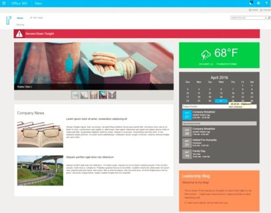
Many users would not recognize this as SharePoint, if not for the Settings icon.
For the brand-conscious among us, applying a logo image and adjusting colors may not be sufficient for enticing users and compelling change within an organization. Customization comes with a word of warning: Enter into it carefully, with a vendor who understands sustainable design. You do not want to have to re-build your intranet every time you upgrade. So go Rogue with your intranet design—make it sexy, make it smart, and make it stick.
Thanks for reading!
M
© 2016 Rogue Services and Solutions, LLC All Rights Reserved